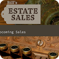
This is a website I created on the Wordpress platform for a client who wanted a very straight-forward way to update himself. Click the image to go to the site.
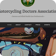
This is another website I created on Wordpress for clients who wanted a very straight-forward way to update the site with current pictures and meeting information. Click the image to go to the site.
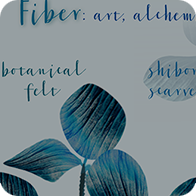
Fiber: art, alchemy, & adornment is the name of my textile accessory business. The recently finished website incorporates multiple image galleries but links to my shop on Etsy for purchasing. If demand and activity on the site increase the code can easily be edited to add product pages and shopping cart capability. Click the image to go to the site.
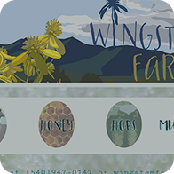
This is the website I designed for my family's farm in Virginia. We grow mushrooms for market, raise chickens for eggs, as well as bees. We wanted an intuitive and simple site that was easy for people to navigate, while still reflecting through image and typeface choices, our sense of humor and friendly approach. I used a little bit of javascript to make the site a little dynamic and interactive, and altered photography of the farm and it's inhabitants to create custom graphics. The typeface we chose for our logo (which I also developed) was not available in web form, but easily accomodated. Click the image to go to the site.
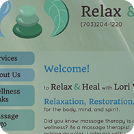
I recently finished this site for a newly licensed massage therapist in Northern Virginia. Her previous page was poorly scaled and not completely functional. It was built on wordpress so we started over from scratch rather than waste valuable time sorting through the overly complicated code. We cleaned up her logo and used her existing cool color scheme. I reorganized some of the content to be more intuitive so potential customers could find the information they desired quickly and easily, while still visually reflecting the calming and restorative nature of her business. Click the image to go to the site.
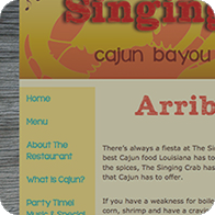
Only text and a logo were provided for this site for a fictional cajun restaurant. I redesigned the logo to be eye-catching and more representative of the atmosphere and offerings of the restaurant. The design for this site was developed with the use of site maps, wireframes, formal mood boards, and ultimately, a focus group to test the site's useability and relevancy. Click the image to go to the site.
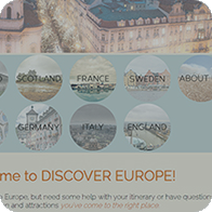
Just copy was provided for this site encouraging millenials to travel to Europe. After altering creative commons images to appeal to the Instagram generation, the muted, earthy color scheme was extended to enhance the page's organization. Click the image to go to the site.
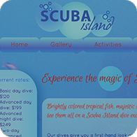
The Scuba Island project was an advanced certificate assignment that provided all copy and the gallery pictures. I selected a color scheme and additional photos, and created a layout using floats. I applied advanced CSS to shapes and gradients to reflect the appeal and experience of scuba diving. Click the image to go to the site.
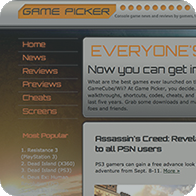
Game images and copy were provided for this assigned website about the latest trends in online gaming. Based on the provided logo I utilized a similar type face, background image, and color scheme to complement while organizing the content intuitively with maximum useability. Click the image to go to the site.
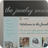
The Jewelry Source site was constructed using some provided images and copy from a certificate class in ecommerce. It included a functioning cart from a third-party provider customized to match the tone and visual look of the parent site (now turned off), as well as images and text chosen to generate sales. It also utilizes contact forms and newsletter sign ups to maximize potential customer communication. Click the image to go to the site.
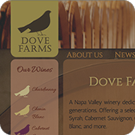
The original images and text were provided for this certificate assigned site for a fictional winery in Napa Valley, CA. The images were altered in Photoshop to reflect the welcoming nature of the proprietors and the color scheme I chose. The provided logo was extended to the navigation to increase brand awareness. Click the image to go to the site.
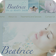
This site was created using competitive analysis, site maps, wireframes, and formal mood boards. All the primary pages can be viewed, while just one treatment example is live. The copy was provided, along with a logo which I redesigned to reflect the light relaxed feeling of a spa. Click the image to go to the site.
